
Description
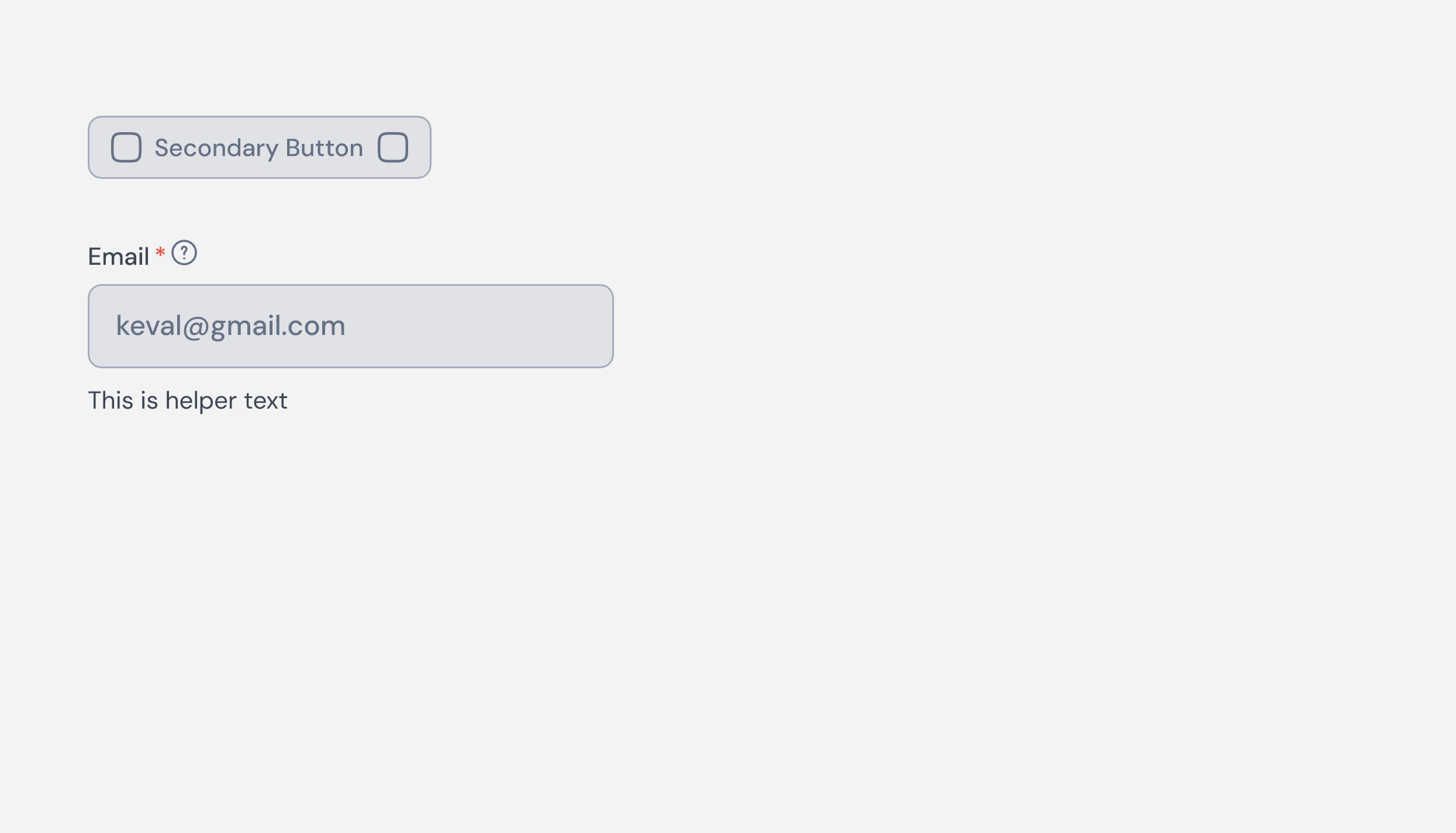
Disabled states in ZenTara UI indicate when a UI element is temporarily inactive or unavailable. These states use visual cues like muted colors, reduced opacity, and no interaction feedback (hover/focus) to signal that the element cannot be interacted with. They help guide users and reduce confusion without removing important elements from the layout.
Usage
Use disabled states to indicate unavailable buttons, links, or fields due to conditions like validation errors, permission restrictions, or incomplete steps in a workflow.