
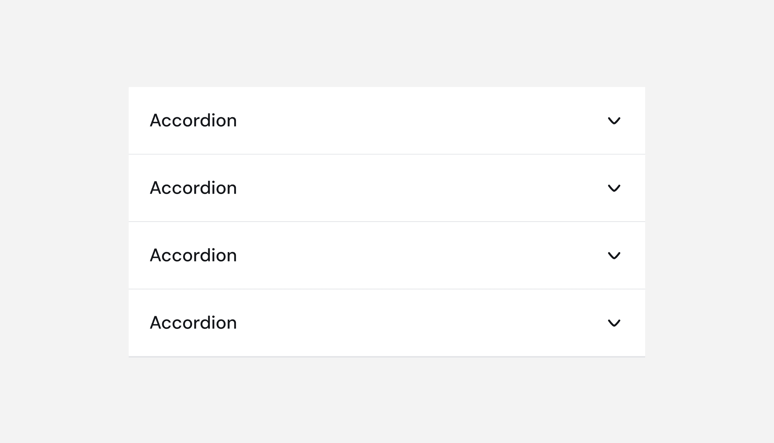
Accordion
Components are the building blocks of a design system, ensuring visual and functional consistency across products. By reusing them systematically, teams can create cohesive, scalable, and efficient user experiences.
Components are the building blocks of a design system, ensuring visual and functional consistency across products. By reusing them systematically, teams can create cohesive, scalable, and efficient user experiences.
Components are the building blocks of a design system, ensuring visual and functional consistency across products. By reusing them systematically, teams can create cohesive, scalable, and efficient user experiences.
Accordion
Accordion
Accordion
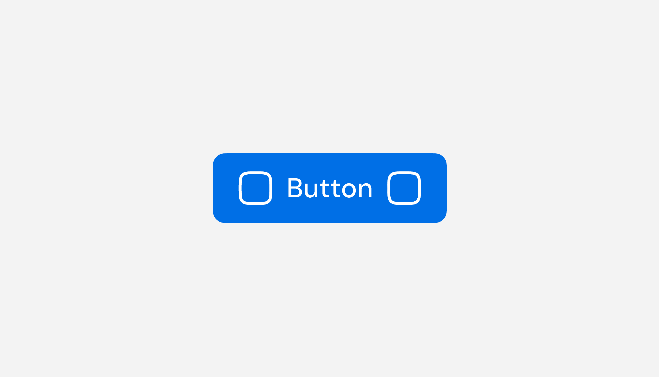
Button
Button
Button
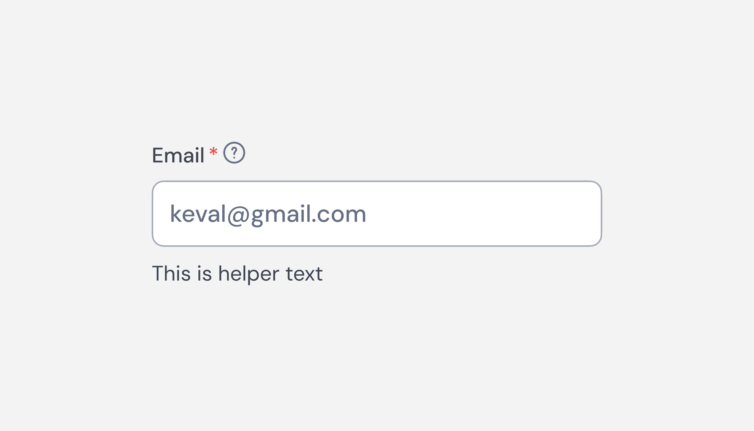
Text Fields (Input Fields)
Text Fields (Input Fields)
Text Fields (Input Fields)
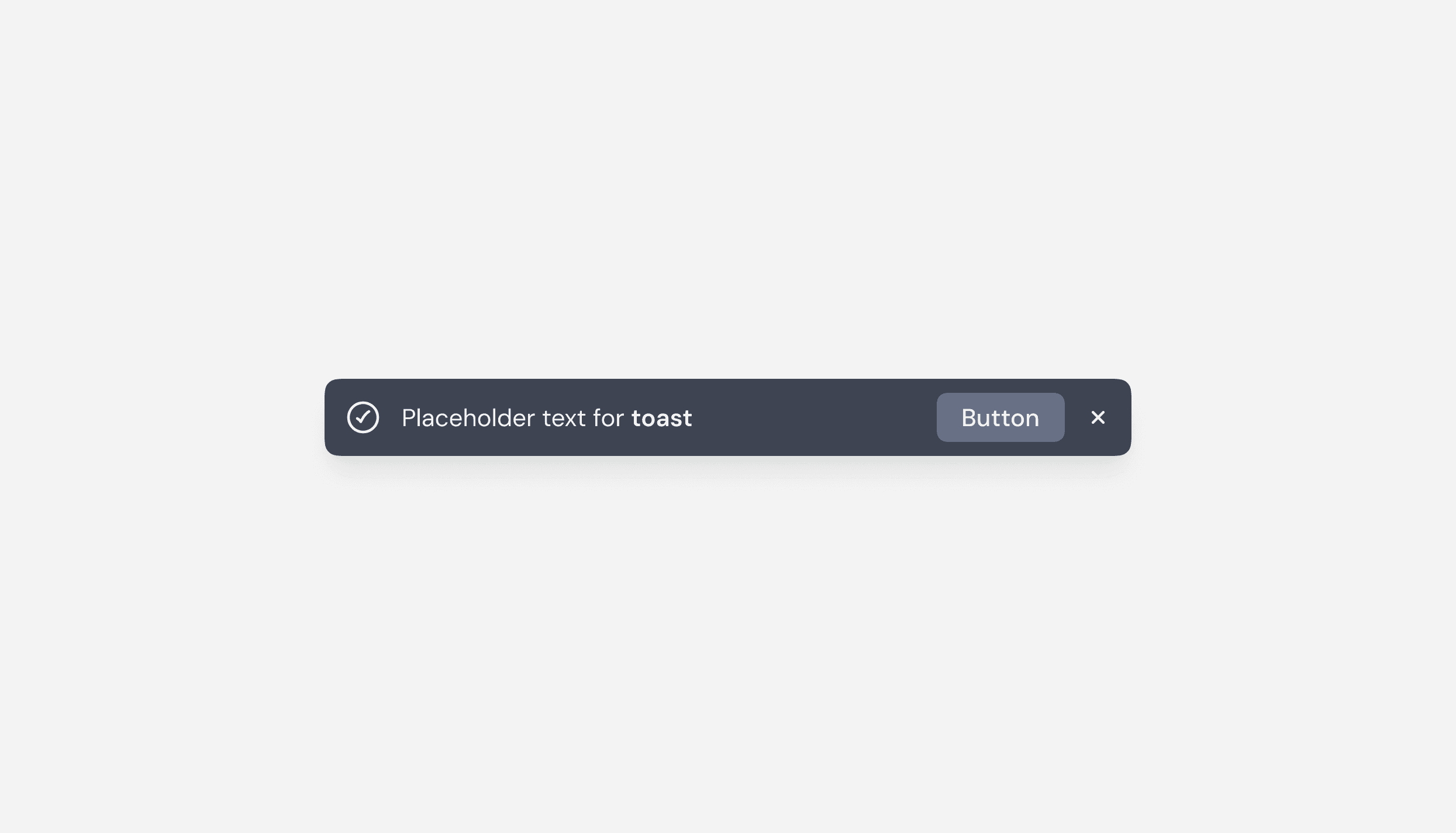
Toast Message
Toast Message
Toast Message
Got feedback or ideas? Help us make ZenTara UI smarter, smoother, and more powerful—every input counts.
Got feedback or ideas? Help us make ZenTara UI smarter, smoother, and more powerful—every input counts.
Got feedback or ideas? Help us make ZenTara UI smarter, smoother, and more powerful—every input counts.