Text Fields in ZenTara UI
Text fields are essential input components that allow users to enter and edit text. ZenTara UI text fields are designed to be clean, accessible, and responsive, adapting seamlessly across devices, platforms, and themes.
Each field is optimized for clarity, usability, and flexibility — with support for light and dark modes, placeholder text, icons, labels, and more.
Key Features
Responsive & Theme-Compatible
Text fields scale gracefully across devices and support both light and dark themes by default.Accessibility Focused
Proper label structure, focus indicators, and keyboard support ensure a smooth experience for all users.
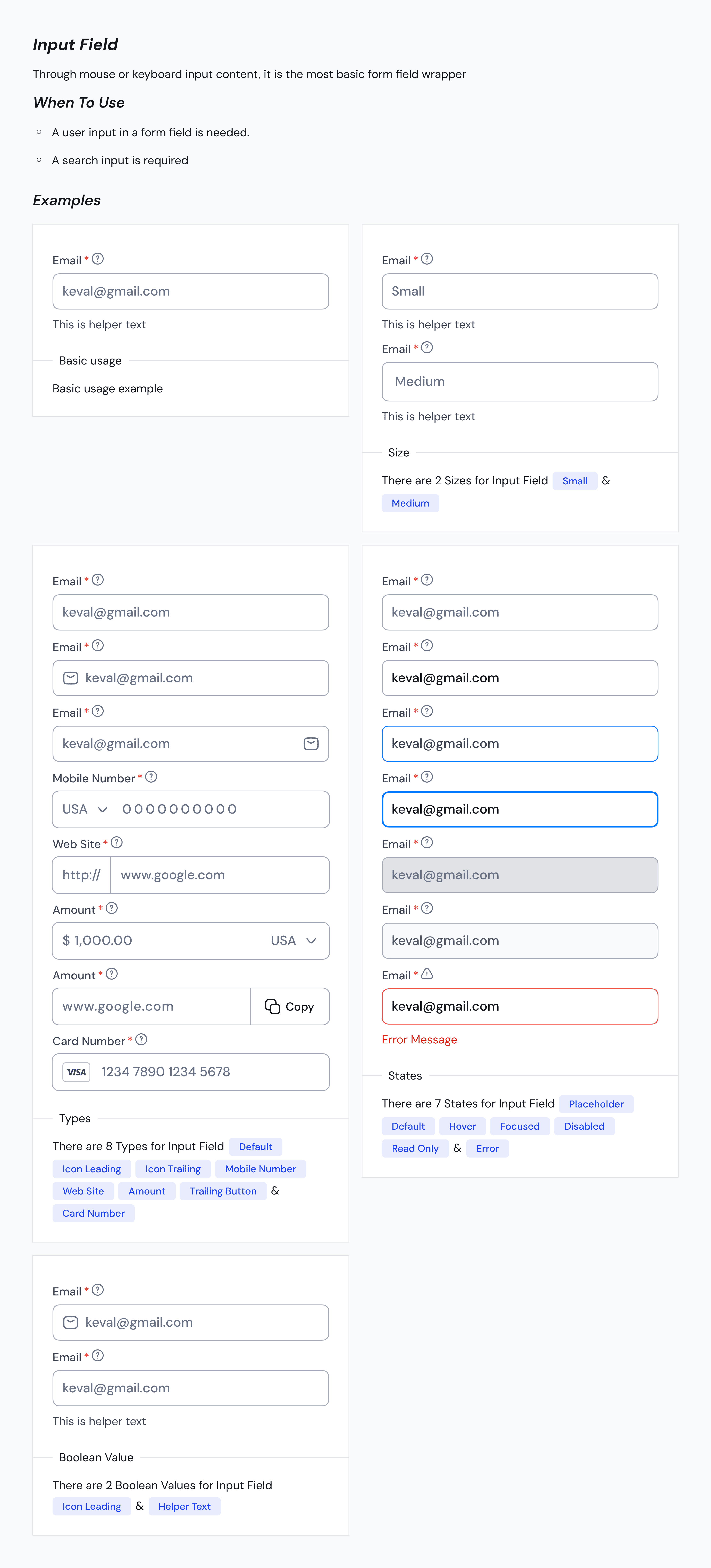
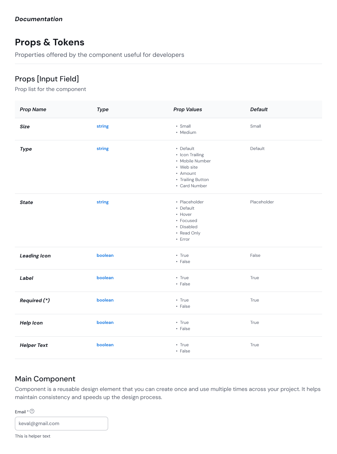
Text Field Variants
ZenTara UI provides 7 versatile text field types to match specific input contexts:
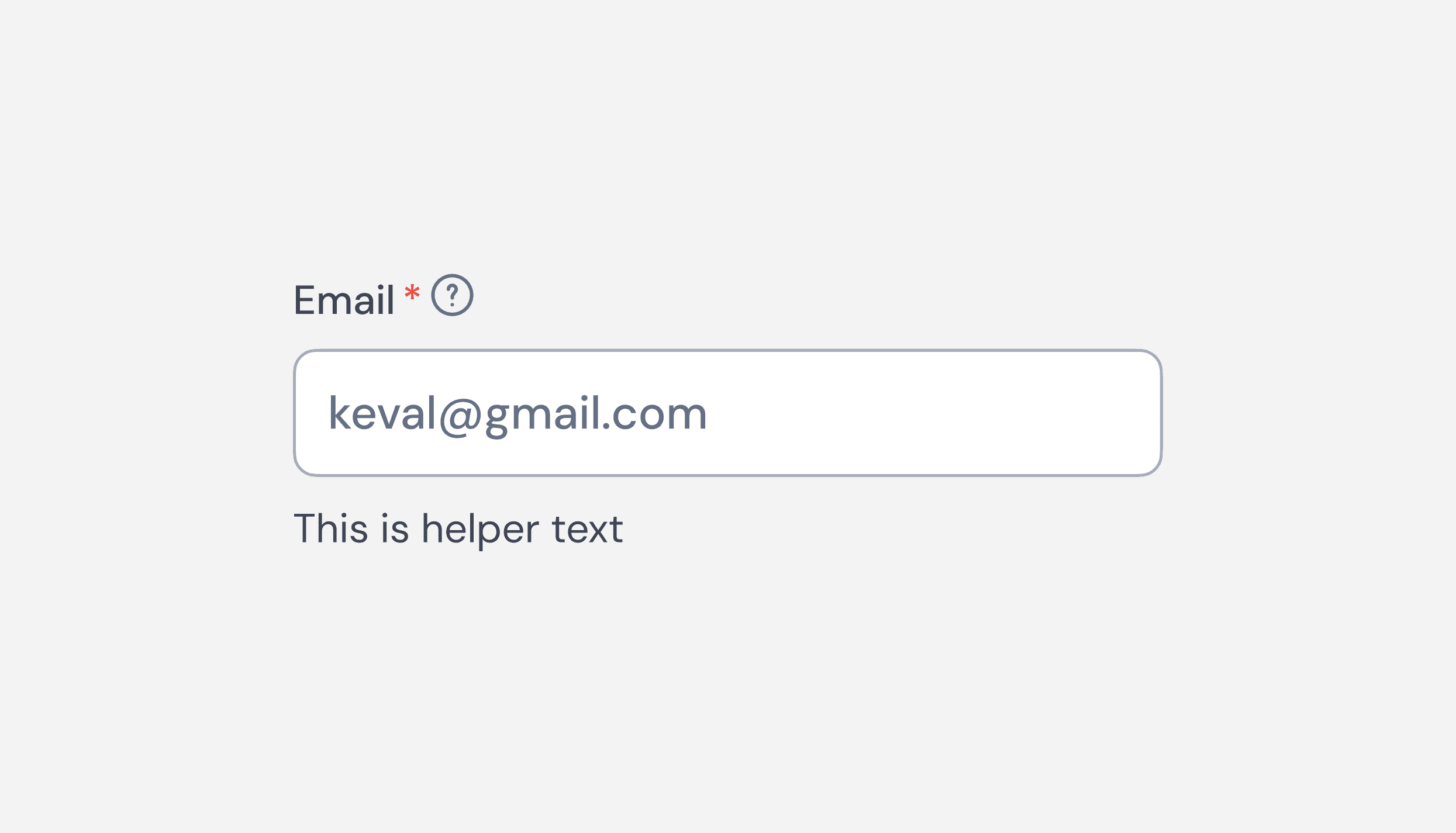
Default
A standard input field for general-purpose text entry.
Clean, minimal design suited for most forms and data inputs.
Icon Trailing
Includes a trailing icon (e.g., eye, calendar, search) to indicate action or input type.
Improves clarity and enhances affordance for user interaction.
Mobile Number
Optimized for phone number input with country code support.
Ensures proper formatting and validation for mobile numbers.
Amount
Designed for currency or numerical input with prefix symbols (e.g., ₹, $, €).
Ensures alignment and input masking for financial data.
Website
Prepares the field for entering URLs, with protocol hints (e.g., https://).
Helps users understand expected format and intent.
Trailing Button
Includes a button at the end of the input (e.g., “Send OTP”, “Check”).
Useful for actions tied directly to field validation or lookup.
Card Number
Specialized formatting for credit/debit card inputs with auto-spacing.
Secure and intuitive design for financial transactions.

Breadcrumbs serve as wayfinding elements, giving users a quick way to backtrack within a website or app. They provide context and help users navigate hierarchical structures efficiently.
Documentation
ZenTara text fields are built with modular styles and clear structure, making them easy to extend and theme. You can add states (focus, disabled, error) and customize labels, placeholders, helper texts, and icons as needed.
Usage
Use ZenTara text fields to capture user input across forms, onboarding screens, checkout flows, and search fields. Choose the appropriate variant to match the context and improve user clarity.