Toast Message

A prominent, interruptive message used to warn users, confirm actions, or notify about critical issues that require attention.

Toast Message

A prominent, interruptive message used to warn users, confirm actions, or notify about critical issues that require attention.

Toast Message

A prominent, interruptive message used to warn users, confirm actions, or notify about critical issues that require attention.

Toast Messages in ZenTara UI

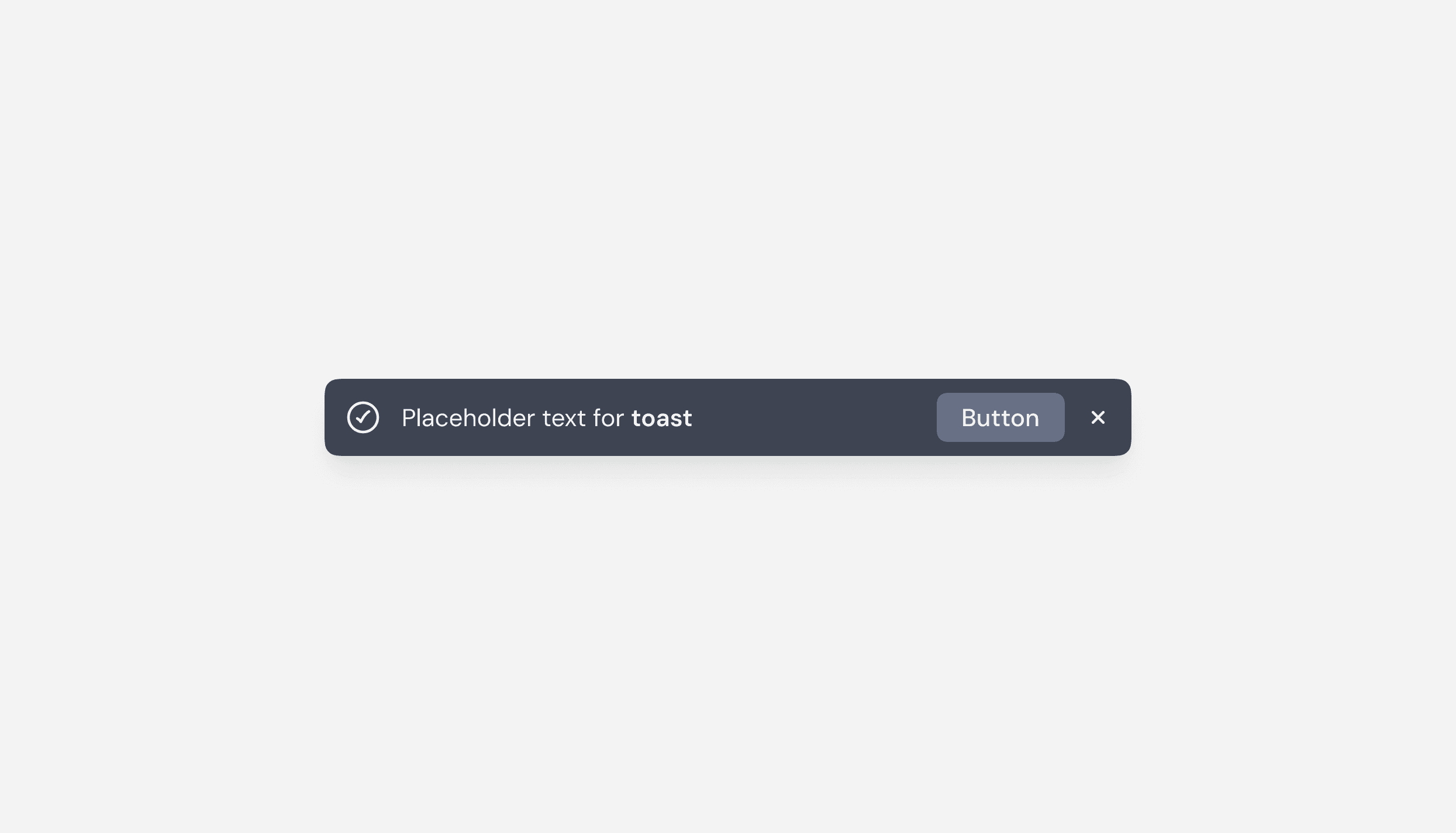
Toast Messages in ZenTara UI provide lightweight, non-blocking notifications that inform users about system status, updates, or actions without interrupting their workflow. They appear temporarily and automatically dismiss after a short duration, ensuring subtle but effective communication.

Designed for clarity and consistency, ZenTara Toasts support both light and dark themes, with smooth animations and accessibility in mind.

A UI component comparison featuring three selection controls: a checkbox, a radio button, and a toggle switch. The checkbox is active, displayed as a black square with a white checkmark, and labeled “Checkbox” in blue. The radio button and toggle switch are inactive, shown in gray with labels “Radio button” and “Toggle” in light gray, indicating they are disabled or not selected. The design visually distinguishes between different selection methods in a user interface.

Key Features

  • Auto-dismiss & Manual Close
    Toasts disappear automatically after a preset duration, but can also include a close icon for manual dismissal.

  • Responsive & Theme-aware
    Built to adapt to all screen sizes and modes, maintaining visibility and legibility in both light and dark UIs.

  • Accessible Feedback
    Supports screen readers and keyboard navigation for inclusive user interaction.

Toast Variants

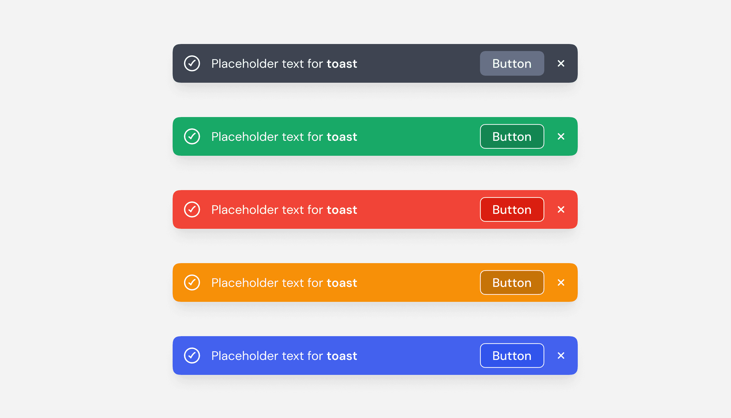
ZenTara Toasts come in four standard types to convey different message intents clearly:

  1. Success

    • Indicates a successful or completed action.

    • Example: “Profile updated successfully.”

  2. Error

    • Used for critical errors or failed actions.

    • Example: “Failed to upload file.”

  3. Warning

    • Warns users of potential issues or risks.

    • Example: “Password is too weak.”

  4. Info

    • Delivers general updates or neutral messages.

    • Example: “You have a new message.”

Documentation

Toast messages are implemented using reusable tokens for spacing, color, icons, and timing. Developers can configure the duration, animation, and position (top-right, bottom-left, etc.) with ease.

The image displays four different checkbox states. The first checkbox is an empty square, representing an unchecked state. The second is a black square with a white checkmark, indicating a checked state. The third is a black square with a white horizontal line, signifying an indeterminate state. The fourth is a gray-outlined checkbox with gray text, representing a disabled state. Each checkbox is accompanied by a label describing its state. The design clearly differentiates between interactive and non-interactive elements.


Usage

Use ZenTara Toasts to provide instant feedback after user actions like saving, deleting, or submitting forms. Ideal for system alerts, confirmations, and notifications that don’t require immediate user intervention.

Continue reading

Contribute to ZenTara UI Kit?

Got feedback or ideas? Help us make ZenTara UI smarter, smoother, and more powerful—every input counts.

Contribute to ZenTara UI Kit?

Got feedback or ideas? Help us make ZenTara UI smarter, smoother, and more powerful—every input counts.

Contribute to ZenTara UI Kit?

Got feedback or ideas? Help us make ZenTara UI smarter, smoother, and more powerful—every input counts.