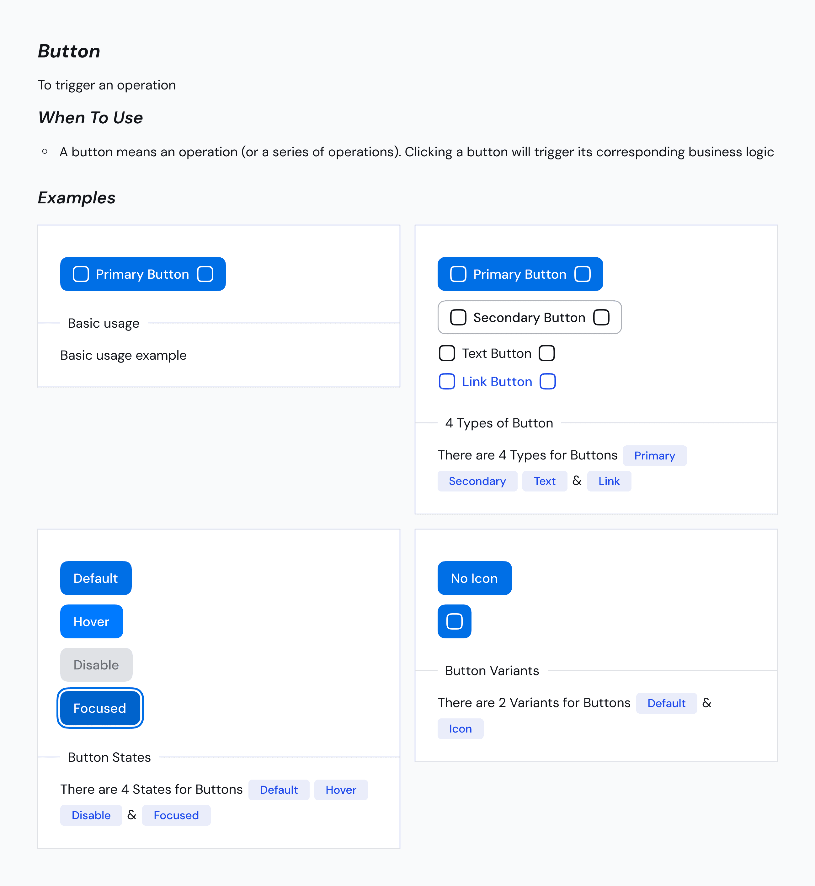
Buttons in ZenTara UI
Buttons in ZenTara UI are powerful interactive elements designed to trigger actions and guide users through your product. Built with consistency, flexibility, and responsiveness in mind, ZenTara Buttons support multiple states and adapt well to both light and dark modes.
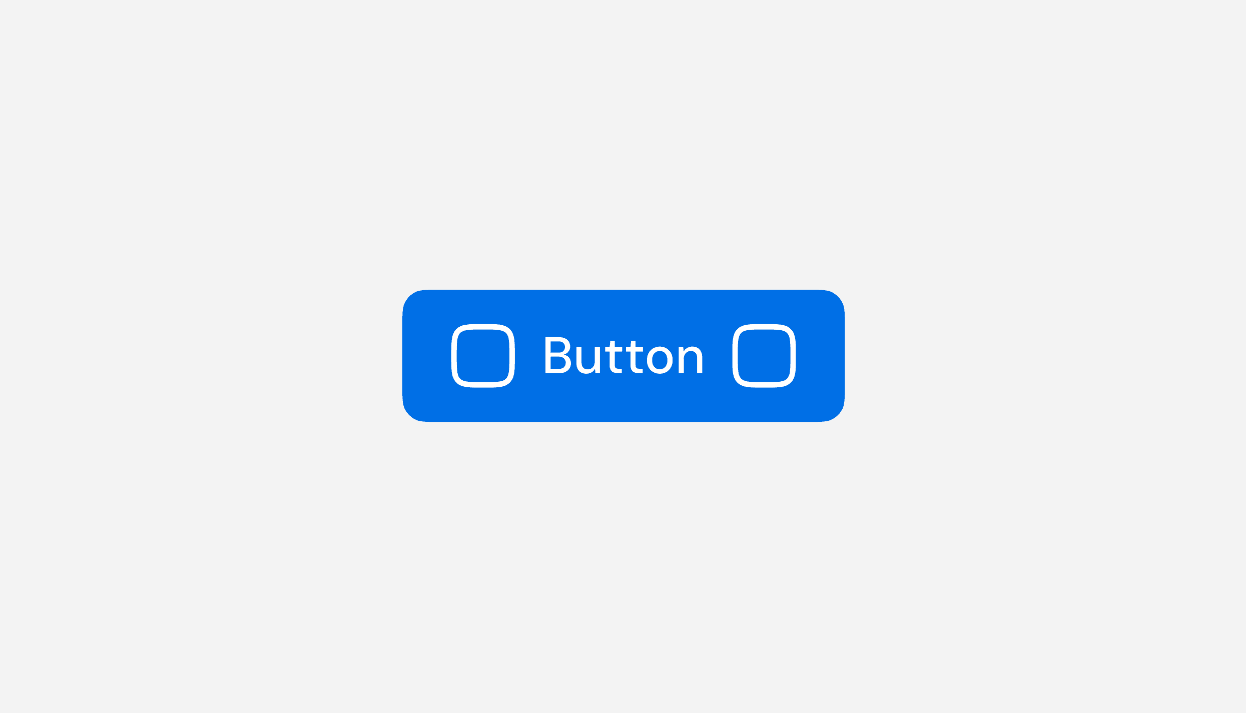
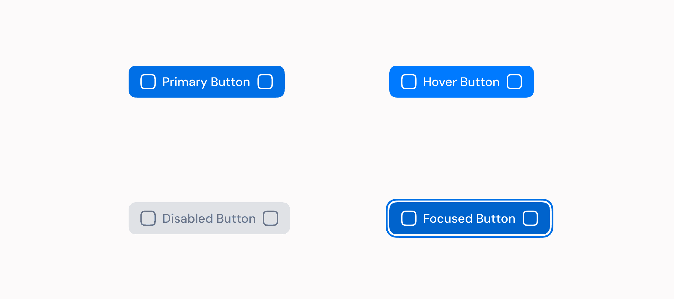
Every button supports hover, focus, and disabled states, as well as optional icons on the left or right — which can be easily removed or customized as needed.
Key Features
Responsive & Theme-aware
Buttons scale elegantly across devices and provide visual clarity in both light and dark themes.Stateful Interactions
All buttons include built-in styles for hover, focus, and disabled states to enhance user experience and accessibility.Icon Support
Easily add or remove icons on the left or right side of the label to enhance context or affordance.
Button Variants
ZenTara UI provides four essential button styles to handle different UI scenarios:
Primary Button
High-emphasis action button used for main CTAs.
Bold styling draws attention to the primary user flow.
Secondary Button
Used for alternative actions that support the main task.
Offers a more subdued visual hierarchy compared to the primary button.
Text Button
Minimal styling with no background or borders.
Ideal for lightweight actions within dense layouts or inline options.
Link Button
Styled like a hyperlink but behaves like a button.
Great for navigation or when triggering soft actions like “Learn more”.

Documentation
ZenTara Buttons are componentized with reusable tokens for color, spacing, and interaction states. Easily customize padding, border radius, icon placement, and text size to suit different use cases.

Usage
Use ZenTara Buttons for form submissions, navigation, in-app actions, or CTAs. Choose the right variant to reflect the button’s importance and maintain a clear visual hierarchy across your interface.