Accordion

An accordion is a UI component that organizes content into collapsible sections, allowing users to expand or collapse information as needed. It helps keep interfaces clean and structured by displaying only relevant content at a given time.

Accordion

An accordion is a UI component that organizes content into collapsible sections, allowing users to expand or collapse information as needed. It helps keep interfaces clean and structured by displaying only relevant content at a given time.

Accordion

An accordion is a UI component that organizes content into collapsible sections, allowing users to expand or collapse information as needed. It helps keep interfaces clean and structured by displaying only relevant content at a given time.

Accordion in ZenTara UI

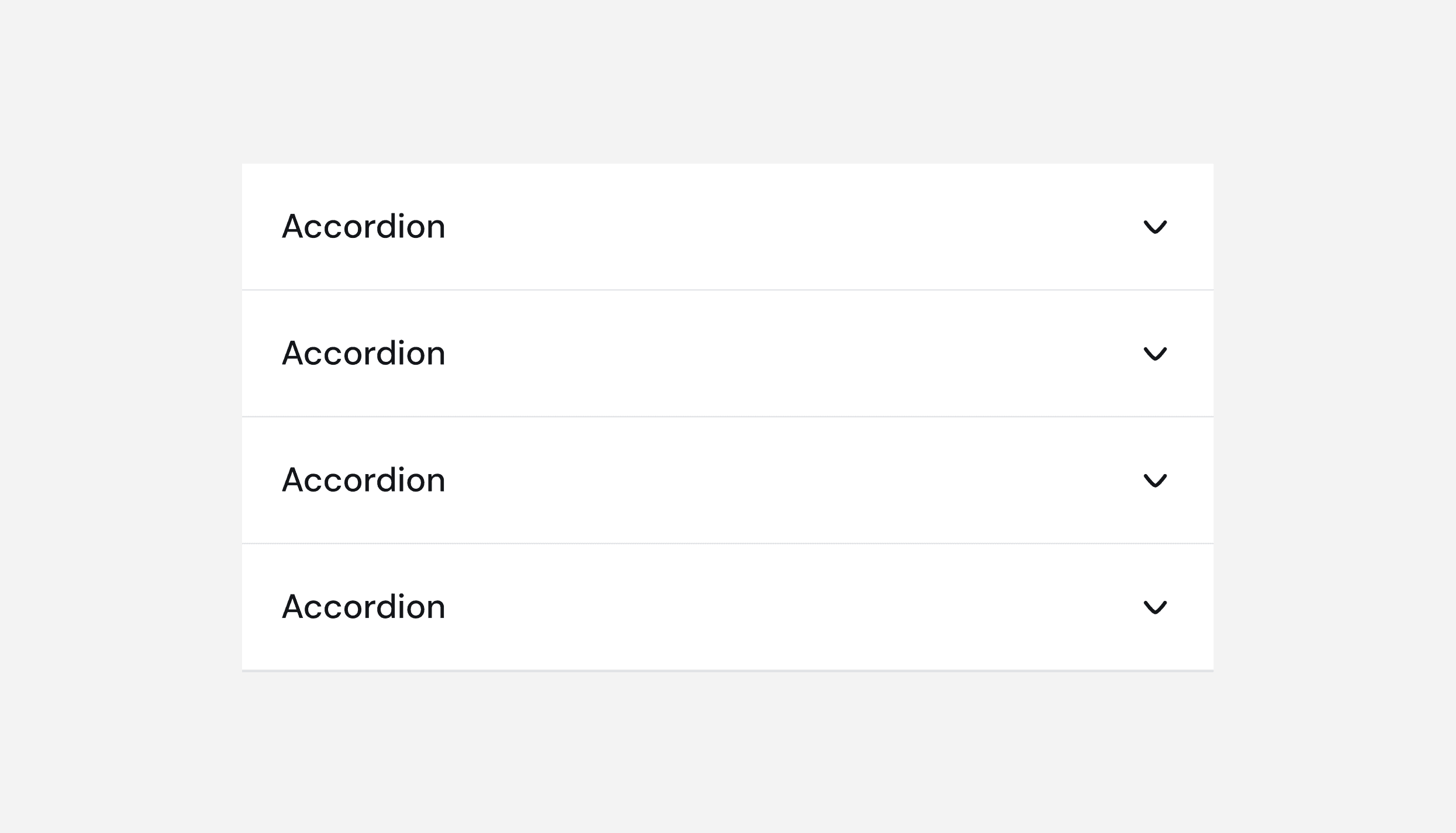
The ZenTara Accordion component provides a flexible and accessible way to display collapsible content sections, allowing users to reveal or hide information as needed without overwhelming the interface.

ZenTara Accordions are designed to be fully responsive, ensuring smooth interaction across all screen sizes. They also support both light and dark modes out of the box, maintaining visual consistency across themes.

A frequently asked questions (FAQ) accordion UI component with three sections. The first section, labeled ‘What is this template for?’, is collapsed and has a ‘+’ icon on the right. The second section, labeled ‘Do I need coding skills to use this template?’, is expanded and displays the answer: ‘No, this template is built entirely in Framer, making it easy to customize without writing code.’ It has a ‘-’ icon on the right. The third section, labeled ‘Can I customize the template to fit my needs?’, is collapsed and has a ‘+’ icon on the right.

Key Features

  • Responsive by Design
    The Accordion component adjusts gracefully to different screen sizes and orientations, ensuring usability on both desktop and mobile devices.

  • Theme Compatibility
    Supports light and dark modes seamlessly, with dynamic styling that adapts to the system or app-level theme settings.

  • Accessible Interactions
    Built with accessibility in mind, ZenTara Accordions support keyboard navigation and ARIA roles to ensure compatibility with screen readers and assistive technologies.When to use

Accordion Variants

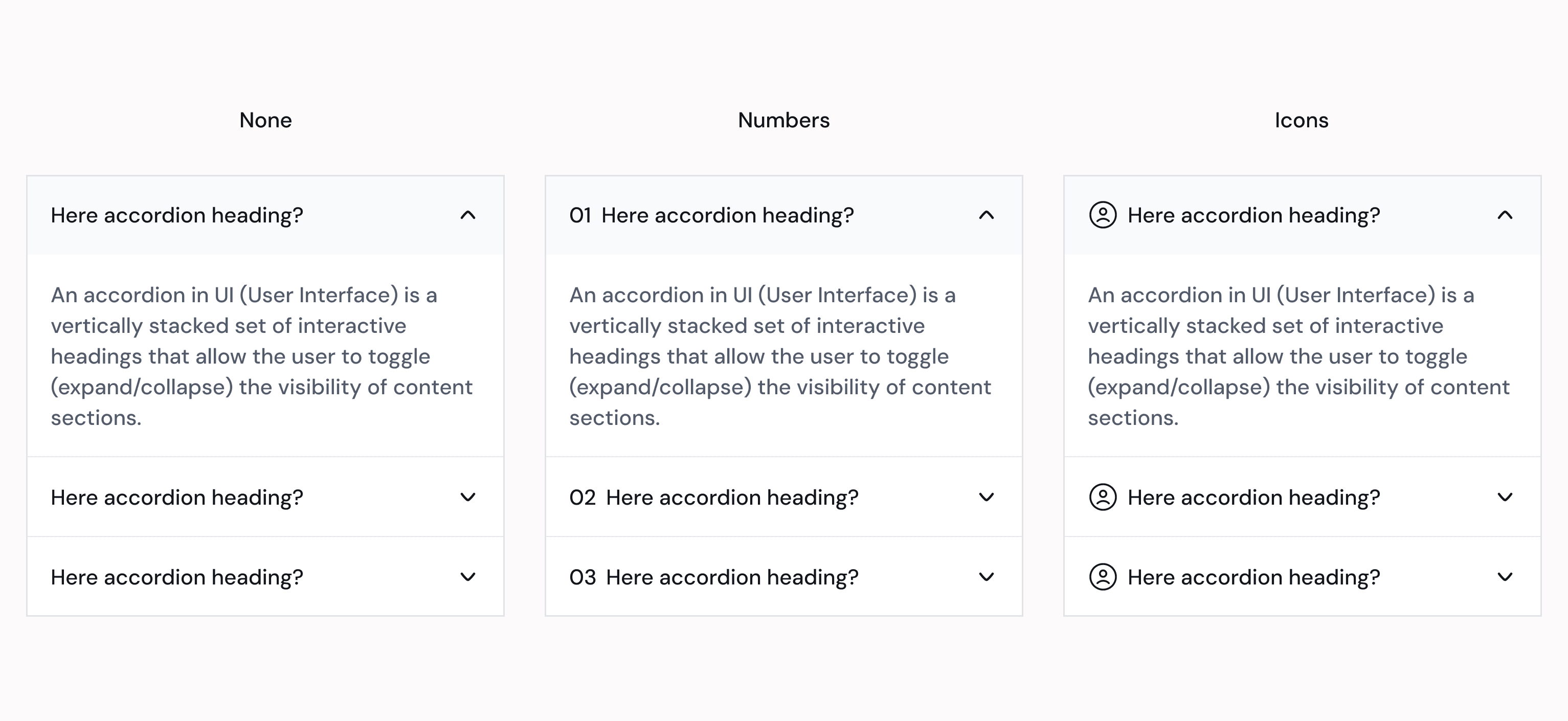
ZenTara offers three distinct visual styles for accordions to suit different UI needs:
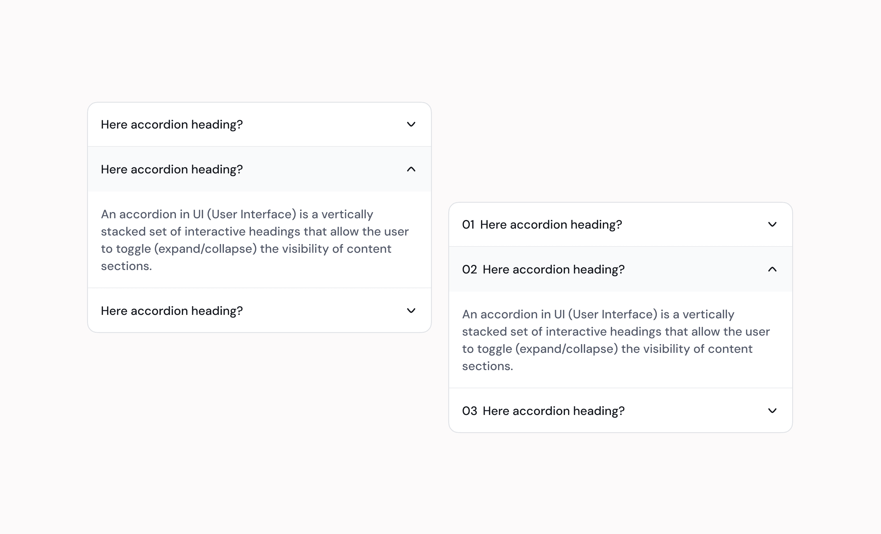
  1. Default (None)

    • Clean and minimal design with no additional leading elements.

    • Ideal for content-focused sections where simplicity is preferred.

  2. Numbered

    • Adds a numeric prefix to each accordion item to indicate order or steps.

    • Useful in step-by-step flows, onboarding, or documentation sequences.

  3. Icon

    • Displays an icon before the title for quick visual categorization.

    • Perfect for use cases where the content relates to status, category, or function.

An accordion-style UI component with two sections. The top section, labeled ‘More info,’ has a red circle with a slash icon indicating a poor label choice. The bottom section, labeled ‘Shipping & Returns,’ has a green checkmark icon indicating a good label choice. Both sections have a ‘+’ icon on the right, suggesting they can be expanded.

Use Cases

  • FAQs and Help Sections

  • Feature Descriptions or Specs

  • Step-by-step Guides

  • Collapsible Forms or Filters

  • Mobile-friendly Content Navigation

Continue reading

Contribute to ZenTara UI Kit?

Got feedback or ideas? Help us make ZenTara UI smarter, smoother, and more powerful—every input counts.

Contribute to ZenTara UI Kit?

Got feedback or ideas? Help us make ZenTara UI smarter, smoother, and more powerful—every input counts.

Contribute to ZenTara UI Kit?

Got feedback or ideas? Help us make ZenTara UI smarter, smoother, and more powerful—every input counts.